位置响应固定按钮到div容器css
问题描述 投票:0回答:3
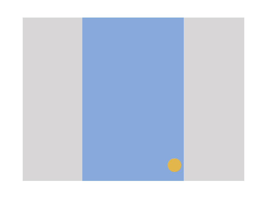
我想在右下角响应一个按钮。到目前为止,我已将按钮固定在居中的容器上。
问题
如果我在任何时候拉伸页面(上下,或上下两侧),它会消失/稍微失去焦点。
预期:
即使浏览器被拉伸,我希望这个黄色按钮始终可见。
码:
    .container{
     margin:0 auto;
     max-width:480px;
     height: 50vh;
     width: 100%;
     text-align:center;
     background:blue;
      }
    .fixed_button{
    position: fixed;
    bottom: 10px;
    width: 70px;
    height: 20px;/*height: auto;*/
    margin-left: 405px;
    border: 0px solid #d6d6d6;
    z-index: 99;
    padding: 0;
    text-align: center;
    background: yellow;
     }
     .spaces{
      width: 100%;
      height: 500px;
      border: 1px solid #000;
     }
<div class="container">
<div class="spaces"></div>
<div class="spaces"></div>
<div class="spaces"></div>
<div class="spaces"></div>
<div class="spaces"></div>
<div class="fixed_button"></div>
</div>此外,如果您想要查看可见性效果,只需打开代码段,单击full page并拉伸窗口。
容器:蓝色和固定按钮:黄色。
顺便说一句,容器有一个加载插件的croll,所以它随着用户向下滚动页面向下增长,所以.container增长,按钮不能绝对定位。
3个回答
2
投票
投票
您可以使用绝对位置对齐div底部的按钮。您可以尝试将css更改为此。
    .fixed_button{
     position: absolute;
     bottom: 5px;
     right: 5px;
     width: 70px;
     border: 0px solid #d6d6d6;
     //wrest of your styles
     }
这应该有你想要的行为。希望这可以帮助
0
投票
投票
如果您希望按钮固定在右下角,则可以使用position:absolute而不是fixed。
如果您想要响应式设计,则不要将margin属性与PX值一起使用。尝试使用百分比(%)
请尝试以下代码段,
.fixed_button{
position: absolute;
bottom: 10px;
right: 10px;
width: 70px;
height: auto;
padding: 25px;
border: none;
z-index: 99;
-webkit-transform: translate3d(0,0,0);
-webkit-transition: all .25s ease;
-moz-transition: all .25s ease;
-ms-transition: all .25s ease;
-o-transition: all .25s ease;
transition: all .25s ease;
text-align: center;
 }
我希望这个能帮上忙,
0
投票
投票
根据您的要求,纯CSS解决方案不起作用。在窗口调整大小后,您必须使用Jquery计算容器的宽度,然后计算正确的位置,然后将其分配给固定元素。
$(window).on('resize', function(){
   var conwidth = $('.container').width()/2 - 30;
   $('.fixed_button').css('left','calc(50% + '+conwidth+'px)');
});
.container{
margin:0 auto;
max-width:480px;
height:600px;
text-align:center;
background:blue;
}
.fixed_button{
position: fixed;
bottom: 0px;
left: calc(50% + 210px);
width: 30px;
border-radius:50%;
height:30px;
z-index: 99;
background: yellow;
}<script src="https://ajax.googleapis.com/ajax/libs/jquery/2.1.1/jquery.min.js"></script>
<div class="container">
<div class="fixed_button"></div>
</div>所以我做了计算,比如获取容器宽度,然后除以2然后减去固定元素宽度。之后,我将其应用为固定元素的左侧位置。
这是你可以玩的JSFIDDLE。
最新问题
- 使图像覆盖浏览器窗口的宽度和高度,并保持滚动条不被剪切
- 如何通过自定义搜索 API 拉取 Google 生成式 AI 的响应?
- 量化感知训练:ValueError:`to_quantize`只能是 keras 顺序模型或函数模型
- 我的 css :hover 属性在单击元素并保留在那里时不会在移动设备上删除。并且 :active 属性在延迟后也可以工作
- MAUI Shell 导航崩溃(随机?)(Windows)
- Linux gedit 插件“转到定义”
- 为什么 phpMyAdmin 在我的表名后面添加“_seq”?除了 next_val 之外没有其他属性
- 为什么在 swiftui 中使用 swift 图表框架制作条形图时默认不显示 x 和 y 轴值
- Rust Axum,处理程序 fn 中返回的二进制类型
- 深度优先非递归树遍历器的产量深度?
- 如何在特定的注入环境中提供角度保护?
- 适用于 Mac OS X 10.6 的 Ada 编译器
- Delphi 命令行编译器
- 如何将递归联合类型转换为顶层联合
- 将坐标标准化为度数对
- git merge-file:如何将冲突合并到<base-file>?
- 如何将图标集成到角度库中?
- 如何将protobuf字节数组反序列化为java对象
- 为什么入口方法会被调用两次?
- 静态方法“buildExpression”要求“DescriptionInputView”符合“AccessibilityRotorContent”
© www.soinside.com 2019 - 2024. All rights reserved.