使用flex-box将列拆分为2个不相等的行
问题描述 投票:0回答:1
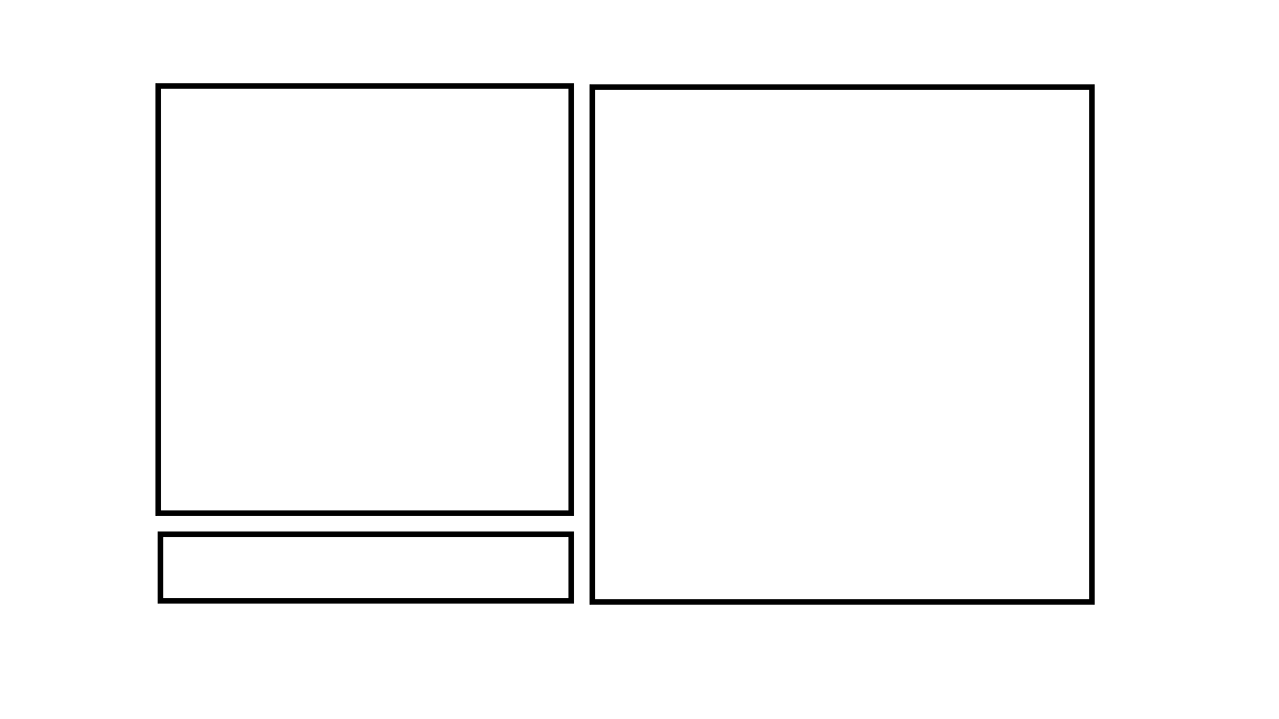
我正在尝试进行如下图所示的布局,但我不知道如何指定列以使其像它一部分的3/4,而另一部分是1/4,我是m尝试使用flexbox
我想要的布局看起来像
我不知道该如何表达我的意思:D仍然是flexbox的新手。
但是在我尝试创建此东西的下面,但是我无法使第一列包含两个不相等的行。
.container{
    display: grid;
    width: 100%;
    height: 45vw;
    margin: auto;
    gap: 25px;
    border: 2px solid red;

    grid-template-columns: repeat(2,fr);
    grid-template-rows: repeat(2,fr);
    grid-template-areas:
    "cmd  grph grph grph  "
    "write grph grph grph";

}

.box{
    display: flex;
    /*flex-direction: row;*/
    align-items: center;
    justify-content: center;
    border: 5px solid black;
}


.dot {
    height: 50px;
    width: 50px;
    background-color: blueviolet;
    border-radius: 50%;
  }

  #cmd{
      grid-area: cmd;

  }
  #grph{
      grid-area: grph;
  }
  #write{
      grid-area: write;
  }
<!DOCTYPE html>
<html>
<head>
<link rel="stylesheet" href="/style/style.css">
</head>
<body>
<div class="container" id="cmd" >
<div class="command box"></div>
<div id="grph" class="box"></div>
<div id="write" class="box"></div>
</div>
</body>
</html>1个回答
0
投票
投票
这是您的代码:
.container {
   display: grid;
   grid-template-rows: repeat(2,fr);
}
如果要两个网格区域分别分割3/4和1/4,为什么要使用两行?请改用四行。
.container {
  display: grid;
  height: 45vw;
  gap: 25px;
  border: 2px solid red;
  grid-template-columns: repeat(2, fr);
  grid-template-rows: repeat(4, fr);
  grid-template-areas:
    "cmd  grph grph grph  "
    "cmd  grph grph grph  "
    "cmd  grph grph grph  "
    "write grph grph grph";
}

.command  { grid-area: cmd; }
#grph     { grid-area: grph;  }
#write    { grid-area: write; }

.box      { border: 5px solid black; }
<div class="container" id="cmd">
<div class="command box"></div>
<div id="grph" class="box"></div>
<div id="write" class="box"></div>
</div>最新问题
- Copilot Studio Azure 开放 AI 奖状
- 在 Chrome 扩展中拦截 XMLHttpRequest 的问题
- docker 中找不到文件
- 如何在 Windows 10 中自定义游戏手柄控制器操纵杆输出灵敏度
- NSTableView 选择时更改单元格颜色
- 'main' 已在 xxx.obj 中定义
- Etsy - 获取销售额
- 在打字稿中用 import 替换 require
- 如何检查不同的属性
- monorepo (lerna) 包内的 React 应用程序导致“react”包发生冲突
- 提供接口的方法而不是在java中实现接口
- 我做了问题用餐时间需要做的事情,但我不知道如何改进这段代码来解决这个问题
- 在 Jitpack 中构建 Android 库:错误:未找到构建工件
- 如何计算从一行列到下一行不同列的 DateDiff
- 测试变量是否为只读
- Tensorflow 无法识别 CUDA 11.8,但 Pytorch 可以识别
- CSS 将 4 个分区放在页面底部
- 如何使用 telethon 会话文件通过 Pyrogram 登录
- git push --镜像失败
- 在库比蒂诺选项卡栏视图内外导航
© www.soinside.com 2019 - 2024. All rights reserved.