如何在按钮右侧添加图像/图标?
问题描述 投票:0回答:10
这些天我正在开发Android平台的flutter移动应用程序。我想添加一个带有文本和图标/图像的按钮。该图像必须位于按钮文本的右侧。
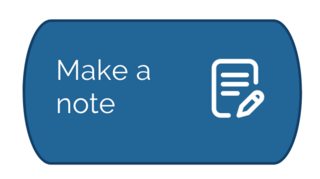
我已经在此处附加了图片。
这是我的代码。
child: FlatButton.icon(
     icon: Image.asset("images/notesicon.png", width: 20.0,height: 20.0,),
     label: Text("Add Note",
        style: TextStyle(
           fontSize: 11.0,
           fontFamily: "Raleway"
        ),
     ),
     textColor: Colors.white,
     color: Color(0xFF226597),
     shape: OutlineInputBorder(borderSide: BorderSide(
               style: BorderStyle.solid,
               width: 1.0,
               color: Colors.black),
            borderRadius: new BorderRadius.circular(20.0)
      ),
    ),
10个回答
59
投票
投票
只需翻转它们即可。 (标签<->图标)因为它们都接受任何小部件。
child: FlatButton.icon(
 icon: Text("Add Note",
    style: TextStyle(
       fontSize: 11.0,
       fontFamily: "Raleway"
    ),
 ),
 label: Image.asset("images/notesicon.png", width: 20.0,height: 20.0,),
 textColor: Colors.white,
 color: Color(0xFF226597),
 shape: OutlineInputBorder(borderSide: BorderSide(
           style: BorderStyle.solid,
           width: 1.0,
           color: Colors.black),
        borderRadius: new BorderRadius.circular(20.0)
  ),
),
22
投票
投票
这里你已经修复了你的代码,不要使用
FlatButton.iconFlatButtonRow SizedBox(
width: 150,
child: FlatButton(
child: Row(
children: [
Text(
"Add Note",
style: TextStyle(fontSize: 11.0, fontFamily: "Raleway"),
),
Image.asset(
"images/notesicon.png",
width: 20.0,
height: 20.0,
)
],
),
onPressed: () {},
textColor: Colors.white,
color: Color(0xFF226597),
shape: OutlineInputBorder(
borderSide: BorderSide(
style: BorderStyle.solid, width: 1.0, color: Colors.black),
borderRadius: new BorderRadius.circular(20.0)),
),
),
8
投票
投票
尝试下面的代码:
FlatButton(
   padding: EdgeInsets.all(10.0),
   child: Row(
   children: < Widget > [
     Text("Make a Note"),
     Icon(Icons.note),
   ],
 ),
)
2
投票
投票
child: FlatButton.icon(
 icon:  Text("Add Note",
    style: TextStyle(
       fontSize: 11.0,
       fontFamily: "Raleway"
    ),
 ),
 label: Image.asset("images/notesicon.png", width: 20.0,height: 20.0,),
 textColor: Colors.white,
 color: Color(0xFF226597),
 shape: OutlineInputBorder(borderSide: BorderSide(
           style: BorderStyle.solid,
           width: 1.0,
           color: Colors.black),
        borderRadius: new BorderRadius.circular(20.0)
  ),
),
1
投票
投票
你可以做这样的事情
 Container(
                width: 150,
                height: 100,
                    padding: EdgeInsets.all(10),
                    decoration: new BoxDecoration(
                      color: Colors.blue[400],
                      border: Border.all(color: Colors.blue[800], width: 4.0),
                      borderRadius:
                      new BorderRadius.all(Radius.circular(40.0)),
                    ),
                    child:Center(child: FlatButton(
                      onPressed: () => {},
                      padding: EdgeInsets.all(5.0),
                      child:Center(child:  Row(
                        mainAxisSize: MainAxisSize.max,
                        mainAxisAlignment: MainAxisAlignment.spaceAround,
                        children: <Widget>[
                          Text("Make A Note"),
                          Icon(Icons.note_add),
                        ],
                      ),),),)),

0
投票
投票
您可以使用此小部件创建带有操作的独立按钮。以及一些必要的 UI 更改。
      Widget btnChooseFromDevice() {
        return Container(
          height: 56.0,
          width: MediaQuery.of(context).size.width,
          child: FlatButton(
            child: Row(
              children: <Widget>[
                SizedBox(width: 20.0,),
                Text(
                  'Choose from Device',
                  style: TextStyle(
                    fontSize: 20.0,
                    fontFamily: 'Righteous',
                    fontWeight: FontWeight.bold,
                  ),
                 Container(
                  width: 36,
                  height: 36,
                  child: Image.asset("assets/images/file.png"),
                ),
                ),

              ],
            ),
            textColor: Colors.white,
            shape:
            RoundedRectangleBorder(borderRadius: BorderRadius.circular(30.0)),
            onPressed: () {
              print('button pressed');
    //          getImage();
            },
          ),
        );
      }
0
投票
投票
Container(
        decoration: new BoxDecoration(
          color: Colors.white,
          border: Border.all(color: Colors.blue, width: 1.0),
          borderRadius: new BorderRadius.all(Radius.circular(3.0)),
        ),
        width: double.infinity,
        child: FlatButton(
          padding: EdgeInsets.all(8.0),
          onPressed: () {},
          child: Row(
            mainAxisAlignment: MainAxisAlignment.spaceBetween,
            children: <Widget>[
              Text("Add a Note"),
              Icon(
                Icons.note_add,
                color: Colors.blue,
              ),
            ],
          ),
        ),
      ),[If you want Flatbutton like this you can use this following code][1]
0
投票
投票
只需使用方向性小部件包裹您的 OutlinedButton.icon,如下所示:这将使图标位于右侧。
Directionality(
  textDirection: TextDirection.rtl,
  child: OutlinedButton.icon(
  onPressed: () {},

 label: Text(Testing),
 icon: const Icon(Icons.cancel,color:Colors.green,))),
0
投票
投票
示例:右侧有文本和图标,图标和文本之间有自定义大小的空间。还增加了添加边框半径、边框大小和更改填充的可能性。
TextButton(
  onPressed: () => _myOnPressTestMethod(),
  child: Row(
    children: <Widget>[
      Expanded(child: Text("Test"),),
      SizedBox(width: 16),
      Icon(Icons.arrow_drop_down, size: 40,)
    ],
  ),
  style: ElevatedButton.styleFrom(
    padding: EdgeInsets.only(left: 16, top: 10, bottom: 10),
    shape: new RoundedRectangleBorder(borderRadius: new BorderRadius.circular(8.0)),
    side: BorderSide(width: 1.0,),
  ),
),
-1
投票
投票
你可以试试这个。
FlatButton(
    padding: EdgeInsets.fromLRTB(8.0, 8.0, 8.0, 8.0),
        child: Row(
            children: < Widget > [
            Text("Add a Note"),
            Icon(Icons.note_add),
         ],
    ),
)
最新问题
- django:在 pypy、psyco、unladensweat 或 cpython 上,哪一个最快? [已关闭]
- 我收到此警告:com.sun.org.apache.xml.internal.serialize.OutputFormat 是 Sun 专有 API,可能会在未来版本中删除
- 如何将列表转换为多列和数据框?
- 如何获取包含shadowRoot元素的文档或节点中的所有HTML
- 在 Chrome 中使用 Selenium 和 Python 下载 PDF:禁用 PDF 查看器
- Perlbrew 无法安装新的 perl 版本
- 如何在64位应用程序中使用32位指针?
- 如何在AnimatedVisibility中设置弹簧类型animationSpec的持续时间?
- 更新 GLMeshItem 的颜色
- Unicode 特殊字符 U+FFFD 从我的 Nest.JS API 返回,但只是有时
- 通过 .NET 核心代码将敏感度标签应用到 Microsoft Exchange Mail
- 我的字符串不会在循环中重新声明
- SQL Server 2019 Express Setup.exe 未安装 MSSQL Server 实例
- 循环中使用前三个唯一 ID 填充数组
- Web Essentials Less 导入文件保存不会编译主文件
- D 编程:openssl rsa 前向引用编译器错误
- 在频繁运行的 cron spring 中同时运行多个例程
- 如何在没有 weblogic 控制台的情况下禁用 weblogic 中的管理端口?
- 为什么我需要一个通用的 Locals 类型的 Express 请求?
- 如何防止 pandoc 在内容中插入我标题的 <h1> 元素
© www.soinside.com 2019 - 2024. All rights reserved.