角度 - 材质:进度条自定义颜色?
问题描述 投票:10回答:7
我现在正在努力工作几个小时。我使用Material2,只是想改变进度条的颜色。我知道有那些主题(主要/重音/警告),但我希望我的进度条有一个cutom颜色(绿色)。
我已经尝试过最奇怪的css组合..但没有努力。也许有人有同样的问题?
7个回答
投票
我建议将其中一种预制的主要/警告/强调颜色更改为您的自定义颜色。
在你的styles.scss中(如果你的样式文件是css,你将不得不改变它以支持scss):
  @import '~@angular/material/theming';
  // Plus imports for other components in your app.

  // Include the common styles for Angular Material. We include this here so that you only
  // have to load a single css file for Angular Material in your app.
  // Be sure that you only ever include this mixin once!
  @include mat-core();

  // Define the palettes for your theme using the Material Design palettes available in palette.scss
  // (imported above). For each palette, you can optionally specify a default, lighter, and darker
  // hue.

  $mat-blue: (
    50: #e3f2fd,
    100: #bbdefb,
    200: #90caf9,
    300: #64b5f6,
    400: #42a5f5,
    500: #2196f3,
    600: #1e88e5,
    700: #1976d2,
    800: #1565c0,
    900: #0d47a1,
    A100: #82b1ff,
    A200: #448aff,
    A400: #2979ff,
    A700: #2B66C3,
    contrast: (
      50: $black-87-opacity,
      100: $black-87-opacity,
      200: $black-87-opacity,
      300: $black-87-opacity,
      400: $black-87-opacity,
      500: white,
      600: white,
      700: white,
      800: $white-87-opacity,
      900: $white-87-opacity,
      A100: $black-87-opacity,
      A200: white,
      A400: white,
      A700: white,
    )
  );

  $candy-app-primary: mat-palette($mat-blue, A700);
  $candy-app-accent:  mat-palette($mat-orange, A200, A100, A400);

  // The warn palette is optional (defaults to red).
  $candy-app-warn:    mat-palette($mat-red);

  // Create the theme object (a Sass map containing all of the palettes).
  $candy-a-theme($candy-app-theme);
pp-theme: mat-light-theme($candy-app-primary, $candy-app-accent, $candy-app-warn);

  // Include theme styles for core and each component used in your app.
  // Alternatively, you can import and @include the theme mixins for each component
  // that you are using.
  @include angular-material
投票
你可以使用::ng-deep选择器来达到你想要的效果,this answer上有一些信息。
我是怎么做到的
CSS
::ng-deep .mat-progress-bar-fill::after {
background-color: #1E457C;
}
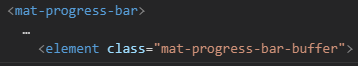
::ng-deep .mat-progress-bar-buffer {
background: #E4E8EB;
}
::ng-deep .mat-progress-bar {
border-radius: 2px;
}
HTML
<mat-progress-bar mode="determinate" value="{{progress}}"></mat-progress-bar>
结果如下:

编辑:
我发现了一种避免使用::ng-deep的方法,因为它将很快从角上移除。似乎如果你将你的风格从component.css文件移动到全局styles.css文件,它将在没有::ng-deep的情况下工作。
因此,上面定义的样式可以改变
mat-progress-bar .mat-progress-bar-buffer {
  background: #E4E8EB;
}
将它移动到styles.css,它将被应用如下:
这对我来说是一个新项目。我没有专门检查旧代码,但条件是相同的,没有理由不工作。
投票
因为到目前为止没人提到......
他是我解决它的方式。
@Meet Dave对他的做法是正确的。但你应该使用encapsulation: ViewEncapsulation.None(禁用css模块)
像这样的东西:
零件
@Component({
  selector: '...',
  templateUrl: '...',
  styleUrls: ['...'],
  encapsulation: ViewEncapsulation.None,
})
萨斯(在我的情况下)
.audio-progress-bar {
  &.mat-progress-bar {
    height: 10px;
  }

  .mat-progress-bar-fill::after {
    background-color: #37474f;
  }

  .mat-progress-bar-buffer {
    background-color: #90a4ae;
  }

  /* remove animation and the dots*/
  .mat-progress-bar-background {
    animation: none;
    background-color: #eceff1;
    fill: #eceff1;
  }
}
视图
<mat-progress-bar
  class="audio-progress-bar"
  mode="buffer"
></mat-progress-bar>
投票
更新:
避免使用deep,TL; DR:Deep在技术上无效(如,深度记录:p)
欲了解更多信息,请参阅:The use of /deep/ and >>> in Angular 2
现在,要改变mat-progress栏的颜色,以下是我如何使用它,
转到styles.scss文件(或项目中的主要css / scss文件)
添加此类 - >
.green-progress .mat-progress-bar-fill::after {
    background-color: green !important;
}
你的mat-progress应该使用上面的类,比如 - >
<mat-progress-bar class="green-progress" mode="indeterminate"></mat-progress-bar>
投票
对我来说,我只需要输入CSS这条规则:
div.mat-progress-bar-primary.mat-progress-bar-fill.mat-progress-bar-element::after{
    background-color: green;
}
但是如果你使用主题,显然会更容易。
投票
角度7和材料7.1.1
 ::ng-deep .mat-progress-spinner circle, .mat-spinner circle{
        stroke: green !important;
}
投票
您可以通过此方法添加自定义类仅覆盖进度条背景颜色,然后通过标记和类的组合应用css,如同
<mat-progress-bar class="my-color" mode="determinate" value="40"></mat-progress-bar>
改为style.css
mat-progress-bar.my-color .mat-progress-bar-fill::after {
  background-color: green;
}
最新问题
- 如何在Android Kotlin中每5秒致电API?
- Sci-kit学习:研究错误分类的数据
- 如何从C#中的QueryPerformancecount
- 不能将ApplicationSights的度量添加到Azure
- 我如何禁用,在键入点(。)视觉工作室后会自动打印fileStyleUriparSer? 不要误会我的意思,我想要这些建议,但我不希望Visual Studio自动
- 我有一个vba excel模型,我将其分为两个单独的工作簿: 包含模型的所有输入的InputswB, RunnerWB,其中包含大部分VBA代码(以及所有
- 在bash中``读''的目的是什么?您如何使用它?
- 如何在C#中为帐户中创建持久字典?
- 如何从另一个数组的值中生成一个随机数组,其值的总和在预定的范围内? 我有一系列正整数,例如[10,25,40,55,80,110]。 我想能够指定一个范围,例如100-150,并从此预先存在的数组中生成一个新数组,其中新的
- 如何支持更改登录电子邮件与Auth0
- 我正在尝试将JS文件保存在Chrome覆盖文件的指定文件夹中,并且每当我按右键单击然后单击“保存为覆盖”时,该文件就不会保存在文件夹中。 \
- 以下反应组件之间有什么区别? [重复]
- 我们如何在角度测试httpresource? 我喜欢Angular的新httpresource,它做了很多我很久以来一直想要的事情。它确实可以使生活更轻松。 但是,我在用茉莉花测试httpresource时遇到麻烦...
- 如何在.NET应用程序中访问GCP Secret Manager,并配置了代理? 我在Google Cloud Run上托管了一个.NET应用程序,需要访问GCP Secret Manager。我的应用程序可以正常工作,但是当我使用环境变量设置代理时(http ...
- 每个子图旁边的传说,python
- 将GhostPCL与图像转换为PDF
- 我有一个IoT中心和用Python编写的Azure函数应用程序。我希望Azure功能能够触发Hub收到的消息。
- 在运行Django测试之前,加载SQL转储
- 如何在我的React节点项目中添加自定义HLS依赖关系的正确方法? 我想从https://github.com/video-dev/hls.js修改来源,然后将其添加到我的项目中。 我下载了https://github.com/video-dev/hls.js消息来源,进行了一些更改,并运行了NPM Run Build。 t ...
- 有人可以在MaxScript中解释struct定义内部的结构定义。