在Flutter中不同的填充之间选择
问题描述 投票:0回答:3
我是家庭自动化项目,我想在填充之间进行选择,因此,例如,其中一个具有'On'和'Off',另一个具有'Lock'和'Unlock'。我试图创建一个函数,所以我在不同的场合调用了每个函数,但是不幸的是,它没有用。我有一个创建CustomCards的函数,我在主文件中调用了这些函数,因此可以创建具有相同面孔的卡片。这是我的代码:
class CustomCard extends StatelessWidget {
final bool isActive;
final String text;
final IconData iconData;
final VoidCallback onTap;

const CustomCard({
this.isActive,
this.text,
this.iconData,
this.onTap,
});

@override
Widget build(BuildContext context) {
return InkWell(
  onTap: onTap,
  child: Container(
    height: 100,
    width: 100,
    child: Card(
      color: isActive ? Colors.white : Colors.grey[800],
      semanticContainer: true,
      shape: RoundedRectangleBorder(
        borderRadius: BorderRadius.circular(10),
      ),
      margin: new EdgeInsets.all(0),
      child: Column(
        mainAxisSize: MainAxisSize.min,
        children: <Widget>[
          Row(
            children: <Widget>[
              Padding(
                padding: EdgeInsets.only(left: 4,top: 7, right: 30, bottom: 10),
                child: Icon(
                  iconData,
                  color: isActive ? Colors.black : Colors.white,
                  size: 35,
                ),
              ),
              Padding(
                padding:
                EdgeInsets.only(top: 0, right: 0, bottom: 20, left: 0),
                child: new Text(
                  isActive ? 'On' : 'Off',
                  style: TextStyle(
                      color: isActive ? Colors.black : Colors.white),
                ),
              ),
            ],
          ),
          Align(
            alignment: Alignment.bottomLeft,
            child: Padding(
              padding: EdgeInsets.only(top: 8, left: 5),
              child: Text(
                text,
                style: TextStyle(
                    color: isActive ? Colors.black : Colors.white,
                    fontSize: 13),
              ),
            ),
          ),
        ],
      ),
    ),
  ),
  );
 }
 }
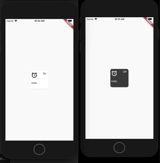
在此小部件中,我希望能够选择何时需要使用On和Off,以及何时需要使用Lock and Unlock:
Padding(
                padding:
                EdgeInsets.only(top: 0, right: 0, bottom: 20, left: 0),
                child: new Text(
                  isActive ? 'On' : 'Off',
                  style: TextStyle(
                      color: isActive ? Colors.black : Colors.white),
                ),
              ),
这是我在主函数中的调用方式,这些第一个自定义按钮需要“锁定”和“解锁”,但第二个需要“开”和“关”。该列表是我跟踪打开还是关闭的位置:
 List<bool> cardsValue = [false, false, false, false];

 CustomCard(
                    iconData: cardsValue[0] ? OMIcons.lock : OMIcons.lockOpen,
                    text: 'Front\nDoor Lock',
                    isActive: cardsValue[0],
                    onTap: () {
                      setState(() {
                        cardsValue[0] = !cardsValue[0];
                      });
                    },
                  ),
                  SizedBox(width: 30.0),
                  CustomCard(
                    iconData: Icons.lightbulb_outline,
                    text: 'Lâmpada 2 Schuma',
                    isActive: cardsValue[1],
                    onTap: () {
                      setState(() {
                        cardsValue[1] = !cardsValue[1];
                      });
                    },
                  ),
3个回答
投票
如果我做对了,您正在寻找具有不同标签的相同小部件(有时是“ on / off”,有时是“ lock / unlock”)。
您可以有两个不同的变量来定义这些标签。我是这样做的:
import 'package:flutter/material.dart';

void main() {
  runApp(Home());
}

class Home extends StatefulWidget {
  @override
  _HomeState createState() => _HomeState();
}

class _HomeState extends State<Home> {
  List<bool> cardsValue = [false, false, false, false];

  @override
  Widget build(BuildContext context) {
    return MaterialApp(
      home: Scaffold(
        body: Column(
          mainAxisSize: MainAxisSize.max,
          mainAxisAlignment: MainAxisAlignment.center,
          children: <Widget>[
            CustomCard(
              activeLabel: 'Lock',
              inActiveLabel: 'Unlock',
              iconData: cardsValue[0] ? Icons.lock : Icons.lock_open,
              text: 'Front\nDoor Lock',
              isActive: cardsValue[0],
              onTap: () {
                setState(() {
                  cardsValue[0] = !cardsValue[0];
                });
              },
            ),
            SizedBox(width: 30.0),
            CustomCard(
              activeLabel: 'On',
              inActiveLabel: 'Off',
              iconData: Icons.lightbulb_outline,
              text: 'Lâmpada 2 Schuma',
              isActive: cardsValue[1],
              onTap: () {
                setState(() {
                  cardsValue[1] = !cardsValue[1];
                });
              },
            ),
          ],
        ),
      ),
    );
  }
}

class CustomCard extends StatelessWidget {
  final bool isActive;
  final String text;
  final String activeLabel;
  final String inActiveLabel;
  final IconData iconData;
  final VoidCallback onTap;

  const CustomCard({
    this.isActive,
    this.text,
    this.iconData,
    this.onTap,
    this.activeLabel,
    this.inActiveLabel,
  });

  @override
  Widget build(BuildContext context) {
    return InkWell(
      onTap: onTap,
      child: Container(
        height: 100,
        width: 120,
        child: Card(
          color: isActive ? Colors.white : Colors.grey[800],
          semanticContainer: true,
          shape: RoundedRectangleBorder(
            borderRadius: BorderRadius.circular(10),
          ),
          margin: new EdgeInsets.all(0),
          child: Column(
            mainAxisSize: MainAxisSize.min,
            children: <Widget>[
              Row(
                children: <Widget>[
                  Padding(
                    padding:
                        EdgeInsets.only(left: 4, top: 7, right: 30, bottom: 10),
                    child: Icon(
                      iconData,
                      color: isActive ? Colors.black : Colors.white,
                      size: 35,
                    ),
                  ),
                  Padding(
                    padding:
                        EdgeInsets.only(top: 0, right: 0, bottom: 20, left: 0),
                    child: new Text(
                      isActive ? activeLabel : inActiveLabel,
                      style: TextStyle(
                          color: isActive ? Colors.black : Colors.white),
                    ),
                  ),
                ],
              ),
              Align(
                alignment: Alignment.bottomLeft,
                child: Padding(
                  padding: EdgeInsets.only(top: 8, left: 5),
                  child: Text(
                    text,
                    style: TextStyle(
                        color: isActive ? Colors.black : Colors.white,
                        fontSize: 13),
                  ),
                ),
              ),
            ],
          ),
        ),
      ),
    );
  }
}
根据评论进行编辑:
如果只需要更改标签周围的填充,还可以像这样为小部件定义填充选项:
import 'package:flutter/material.dart';

void main() {
  runApp(Home());
}

class Home extends StatefulWidget {
  @override
  _HomeState createState() => _HomeState();
}

class _HomeState extends State<Home> {
  List<bool> cardsValue = [false, false, false, false];

  @override
  Widget build(BuildContext context) {
    return MaterialApp(
      home: Scaffold(
        body: Column(
          mainAxisSize: MainAxisSize.max,
          mainAxisAlignment: MainAxisAlignment.center,
          children: <Widget>[
            CustomCard(
              padding: EdgeInsets.only(top: 0, right: 0, bottom: 10, left: 0),
              activeLabel: 'Lock',
              inActiveLabel: 'Unlock',
              iconData: cardsValue[0] ? Icons.lock : Icons.lock_open,
              text: 'Front\nDoor Lock',
              isActive: cardsValue[0],
              onTap: () {
                setState(() {
                  cardsValue[0] = !cardsValue[0];
                });
              },
            ),
            SizedBox(width: 30.0),
            CustomCard(
              padding: EdgeInsets.only(top: 0, right: 0, bottom: 20, left: 0),
              activeLabel: 'On',
              inActiveLabel: 'Off',
              iconData: Icons.lightbulb_outline,
              text: 'Lâmpada 2 Schuma',
              isActive: cardsValue[1],
              onTap: () {
                setState(() {
                  cardsValue[1] = !cardsValue[1];
                });
              },
            ),
          ],
        ),
      ),
    );
  }
}

class CustomCard extends StatelessWidget {
  final bool isActive;
  final String text;
  final String activeLabel;
  final String inActiveLabel;
  final IconData iconData;
  final EdgeInsetsGeometry padding;
  final VoidCallback onTap;

  const CustomCard({
    this.isActive,
    this.text,
    this.padding,
    this.iconData,
    this.onTap,
    this.activeLabel,
    this.inActiveLabel,
  });

  @override
  Widget build(BuildContext context) {
    return InkWell(
      onTap: onTap,
      child: Container(
        height: 100,
        width: 120,
        child: Card(
          color: isActive ? Colors.white : Colors.grey[800],
          semanticContainer: true,
          shape: RoundedRectangleBorder(
            borderRadius: BorderRadius.circular(10),
          ),
          margin: new EdgeInsets.all(0),
          child: Column(
            mainAxisSize: MainAxisSize.min,
            children: <Widget>[
              Row(
                children: <Widget>[
                  Padding(
                    padding:
                        EdgeInsets.only(left: 4, top: 7, right: 30, bottom: 10),
                    child: Icon(
                      iconData,
                      color: isActive ? Colors.black : Colors.white,
                      size: 35,
                    ),
                  ),
                  Padding(
                    padding: padding,
                    child: new Text(
                      isActive ? activeLabel : inActiveLabel,
                      style: TextStyle(
                          color: isActive ? Colors.black : Colors.white),
                    ),
                  ),
                ],
              ),
              Align(
                alignment: Alignment.bottomLeft,
                child: Padding(
                  padding: EdgeInsets.only(top: 8, left: 5),
                  child: Text(
                    text,
                    style: TextStyle(
                        color: isActive ? Colors.black : Colors.white,
                        fontSize: 13),
                  ),
                ),
              ),
            ],
          ),
        ),
      ),
    );
  }
}
但是您也可以将子级和图标定义为widget,因此对于每个小部件,您都可以执行所需的任何配置。
import 'package:flutter/material.dart';

void main() {
  runApp(Home());
}

class Home extends StatefulWidget {
  @override
  _HomeState createState() => _HomeState();
}

class _HomeState extends State<Home> {
  List<bool> cardsValue = [false, false, false, false];

  @override
  Widget build(BuildContext context) {
    return MaterialApp(
      home: Scaffold(
        body: Column(
          mainAxisSize: MainAxisSize.max,
          mainAxisAlignment: MainAxisAlignment.center,
          children: <Widget>[
            CustomCard(
              icon: Padding(
                padding: EdgeInsets.only(
                  left: 4,
                  top: 7,
                  right: 30,
                  bottom: 10,
                ),
                child: Icon(
                  cardsValue[0] ? Icons.lock : Icons.lock_open,
                  color: cardsValue[0] ? Colors.black : Colors.white,
                  size: 35,
                ),
              ),
              child: Padding(
                padding: EdgeInsets.only(
                  left: 0,
                  top: 7,
                  right: 0,
                  bottom: 10,
                ),
                child: new Text(
                  cardsValue[0] ? 'Lock' : 'Unlock',
                  style: TextStyle(
                    color: cardsValue[0] ? Colors.black : Colors.white,
                  ),
                ),
              ),
              label: 'Front\nDoor Lock',
              isActive: cardsValue[0],
              onTap: () {
                setState(() {
                  cardsValue[0] = !cardsValue[0];
                });
              },
            ),
            SizedBox(width: 30.0),
            CustomCard(
              icon: Padding(
                padding: EdgeInsets.only(
                  left: 4,
                  top: 7,
                  right: 30,
                  bottom: 10,
                ),
                child: Icon(
                  Icons.lightbulb_outline,
                  color: cardsValue[1] ? Colors.black : Colors.white,
                  size: 35,
                ),
              ),
              child: Padding(
                padding: EdgeInsets.only(
                  left: 4,
                  top: 7,
                  right: 20,
                  bottom: 10,
                ),
                child: new Text(
                  cardsValue[1] ? 'On' : 'Off',
                  style: TextStyle(
                    color: cardsValue[1] ? Colors.black : Colors.white,
                  ),
                ),
              ),
              label: 'Lâmpada 2 Schuma',
              isActive: cardsValue[1],
              onTap: () {
                setState(() {
                  cardsValue[1] = !cardsValue[1];
                });
              },
            ),
          ],
        ),
      ),
    );
  }
}

class CustomCard extends StatelessWidget {
  final bool isActive;
  final Widget child;
  final String label;
  final Widget icon;
  final VoidCallback onTap;

  const CustomCard({
    this.isActive,
    this.child,
    this.label,
    this.icon,
    this.onTap,
  });

  @override
  Widget build(BuildContext context) {
    return InkWell(
      onTap: onTap,
      child: Container(
        height: 100,
        width: 120,
        child: Card(
          color: isActive ? Colors.white : Colors.grey[800],
          semanticContainer: true,
          shape: RoundedRectangleBorder(
            borderRadius: BorderRadius.circular(10),
          ),
          margin: new EdgeInsets.all(0),
          child: Column(
            mainAxisSize: MainAxisSize.min,
            children: <Widget>[
              Row(
                children: <Widget>[icon, child],
              ),
              Align(
                alignment: Alignment.bottomLeft,
                child: Padding(
                  padding: EdgeInsets.only(top: 8, left: 5),
                  child: Text(
                    label,
                    style: TextStyle(
                        color: isActive ? Colors.black : Colors.white,
                        fontSize: 13),
                  ),
                ),
              ),
            ],
          ),
        ),
      ),
    );
  }
}
投票
您可以执行此操作,但是您应该考虑“哪个需要它?”
如果您的卡在父视图上更改状态,则可以使用无状态小部件并重新构建新状态,例如此代码。您不会忘记声明此函数的父页面,因此包装完整的卡并重建状态。 (不建议看2)
void changeSwitchButton(){setState((){isActiveOnView =!isActiveOnView;});}
您想要在这里:https://gist.github.com/0ec9fca4bd246b21276505ae87cd815b
您在整张卡上制作一个有状态的小部件,因为您的卡小部件需要状态(重建选项)。如果卡具有自己的状态,则视图上的卡小部件自更改不需要任何父更改。此方法是其他情况下更正确的方法。
小部件构建(BuildContext上下文){返回InkWell(onTap:onTapCard,子代:buildContainerCard(),);}无效onTapCard(){setState((){isActive =!isActive;});widget.onTap();}
更详细的外观this存储库。(lib / switch-on)
投票
尝试将CustomCard更改为stateFull Widget。
最新问题
- UNITY 2D 和 WebGL:3D-TextMeshPro 在构建和运行时未显示
- 一直在努力使用 Cron 作业在 conda 环境中执行 python 脚本
- 为什么 std::expected 的 `operator==` 对 SFINAE 不友好?
- 无法在office vba脚本中运行popen命令,运行时错误'32815'
- java中如何访问NetworkRegistrationInfo getNrState()
- 使用自然语言处理来区分员工调查中的坏评论和好评论
- 无法使用 OCI 将 Helm Chart 推送到 Google Cloud ArtifactRegistry
- 为什么当设备进入睡眠状态时,即使我使用 WakeLock,AudioRecord 也不会录制声音?
- Helm 单元测试 - 如何模拟 k8s 实体的“查找”功能?
- 缺少哪些权利?无法继续安装:无法获取有关资源的信息:podsecuritypolicies.policy
- 在 configmap 上注入 helm 值时出现问题
- 接收器不会覆盖指定数据类型的表
- 是否可以将 ARCore Geospatial API 与 flutter ARcore 插件一起使用?
- R:在拼写错误的情况下使用shinyAlert()
- 错误:与磁盘上对应的名称不匹配,REACT
- 为什么 git diff 包含已经合并的提交?
- ASP.NET Core Web API 项目中 Clickhouse DB 的错误脚手架实体
- 使用多核时,Bitbake 失败,退出代码为“1”
- 在应用程序启动时使用 OrientationDidChange 处理 UIScrollView 分页时如何避免“特殊情况”
- 如何使用 aws cli 创建基础设施为 ec2 和 asg 的 aws 集群