如何填充显示:table-cell确定
问题描述 投票:3回答:2
我正试图推出一个类似于表格的布局,左边出现药物名称,数据占据了表格的其余部分。简单的说:
           +-------------+------------+
medicine 1 |  some data  | some data  |
           +-------------+------------+
medicine 2 |  some data  | some data  |
           +-------------+------------+
由于我想保持数据网格动态,我使用两个<div>的样式display:table-cell作为两个容器,左边一个用于所有药物名称,右边一个用于数据网格。在这两个表格单元格<div>中有几个内部<div>,但是当我使用Chrome检查界面进行调查时,我不确定为什么左边有一个大的填充区域(请参见下图):
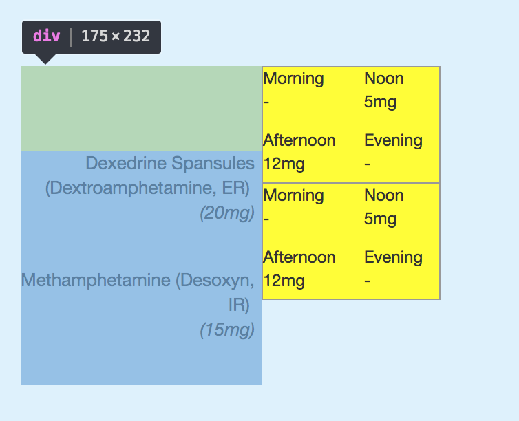
我不太确定哪个部分出了问题,而且检查界面没有给我相关信息。我想学习如何处理这种情况。以下是供您参考的html代码:
<div style="display:table">
  <div style="display:table-row">
    <div style="display:table-cell">
      <div style="height:85px; width:170px; text-align:right; font-size:13px; margin-right:5px">
        Dexedrine Spansules (Dextroamphetamine, ER) <br/><span style="font-style:italic">(20mg)</span>
      </div>
      <div style="height:85px; width:170px; text-align:right; font-size:13px; margin-right:5px">
        Methamphetamine (Desoxyn, IR) <br/><span style="font-style:italic">(15mg)</span>
      </div>
    </div>
    <div style="display:table-cell; overflow:hidden; max-width:800px">
      <div id="medicine_table_container_2" class="medicine-table-container" style="position:relative; left:0">
        <div style="white-space:nowrap; font-size:0px">
          <div style="display:inline-block; background-color:yellow; width:130px; height:85px; border:1px solid #999; font-size: 12px; white-space:normal">
            <div>
              <div style="display:inline-block; width:70px; height:45px">
                Morning<br/>-
              </div>
              <div style="display:inline-block; width:50px; height:45px">
                Noon<br/>5mg
              </div>
            </div>
            <div>
              <div style="display:inline-block; width:70px; height:35px">
                Afternoon<br/>12mg
              </div>
              <div style="display:inline-block; width:50px; height:35px">
                Evening<br/>-
              </div>
            </div>
          </div>
        </div>
      </div>
    </div>
  </div>
</div>2个回答
5
投票
投票
这是关于垂直对齐。默认值设置为baseline并生成此输出。只需将对齐方式更改为top上的table-cell,您就不会遇到此问题:
<div style="display:table">
  <div style="display:table-row">
    <div style="display:table-cell;
    vertical-align: top;">
      <div style="height:85px; width:170px; text-align:right; font-size:13px; margin-right:5px">
        Dexedrine Spansules (Dextroamphetamine, ER) <br/><span style="font-style:italic">(20mg)</span>
      </div>
      <div style="height:85px; width:170px; text-align:right; font-size:13px; margin-right:5px">
        Methamphetamine (Desoxyn, IR) <br/><span style="font-style:italic">(15mg)</span>
      </div>
    </div>
    <div style="display:table-cell;
    vertical-align: top; overflow:hidden; max-width:800px">
      <div id="medicine_table_container_2" class="medicine-table-container" style="position:relative; left:0">
        <div style="white-space:nowrap; font-size:0px">
          <div style="display:inline-block; background-color:yellow; width:130px; height:85px; border:1px solid #999; font-size: 12px; white-space:normal">
            <div>
              <div style="display:inline-block; width:70px; height:45px">
                Morning<br/>-
              </div>
              <div style="display:inline-block; width:50px; height:45px">
                Noon<br/>5mg
              </div>
            </div>
            <div>
              <div style="display:inline-block; width:70px; height:35px">
                Afternoon<br/>12mg
              </div>
              <div style="display:inline-block; width:50px; height:35px">
                Evening<br/>-
              </div>
            </div>
          </div>
        </div>
        <div style="white-space:nowrap; font-size:0px">
          <div style="display:inline-block; background-color:yellow; width:130px; height:85px; border:1px solid #999; font-size: 12px; white-space:normal">
            <div>
              <div style="display:inline-block; width:70px; height:45px">
                Morning<br/>-
              </div>
              <div style="display:inline-block; width:50px; height:45px">
                Noon<br/>5mg
              </div>
            </div>
            <div>
              <div style="display:inline-block; width:70px; height:35px">
                Afternoon<br/>12mg
              </div>
              <div style="display:inline-block; width:50px; height:35px">
                Evening<br/>-
              </div>
            </div>
          </div>
        </div>
      </div>
    </div>
  </div>
</div>
由于您的代码有点复杂,因此这是一个重现问题并更好地了解正在发生的事情的基本代码:
.table {
  display: table;
  border: 1px solid;
  margin: 5px;
}

.table>div {
  display: table-row;
}

.table>div>span {
  display: table-cell;
  padding: 0 5px;
}

.table>div>span span {
  display: inline-block;
}
baseline
<div class="table">
<div>
<span>one line</span>
<span><span>two <br> line (inline-block)</span></span>
</div>
</div>
baseline
<div class="table">
<div>
<span>two<br> line</span>
<span><span>two <br> line (inline-block)</span></span>
</div>
</div>
baseline (with overflow:hidden)
<div class="table">
<div>
<span>one line</span>
<span><span style="overflow:hidden;">two <br> line</span></span>
</div>
</div>
baseline (with overflow:hidden)
<div class="table">
<div>
<span>one line</span>
<span><span style="overflow:hidden;">another line</span></span>
</div>
</div>
top will fix all the cases
<div class="table">
<div>
<span style="vertical-align:top;">one line</span>
<span><span>two <br> line</span></span>
</div>
</div>
<div class="table">
<div>
<span style="vertical-align:top;">one line</span>
<span><span style="overflow:hidden;">two <br> line</span></span>
</div>
</div>
<div class="table">
<div>
<span style="vertical-align:top;">one line</span>
<span><span style="overflow:hidden;">another line</span></span>
</div>
</div>
<div class="table">
<div>
<span style="vertical-align:top;">two<br> line</span>
<span><span>two <br> line (inline-block)</span></span>
</div>
</div>您可以清楚地看到inline-block(和overflow:hidden)的使用是如何成为罪魁祸首,因为它使基线计数器的计算直观和意外。
1
投票
投票
我看到Temani Afif已经为你原来的问题提供了solution。但是如果它无论如何对任何人有帮助,这里是带有子表的表的基本结构
样式
<style>
    .table {
        display:table; border:1px solid #ccc; border-collapse:collapse
    }
    .table .row {
        display:table-row; border:1px solid #ccc; border-collapse:collapse
    }
    .table .row .headercell {
        display:table-cell; border:1px solid #ccc; height: 80px; width: 150px; border-collapse:collapse
    }
    .table .row .cell {
        display:table-cell; border:1px solid #ccc; height: 80px; Width: 300px; border-collapse:collapse
    }
</style>
表结构
<div class="table">
    <div class="row">
        <div class="headercell">
            Row1
        </div>
        <div class="cell">
            <div class="table">
                <div class="row">
                    <div class="cell">
                        Cell1
                    </div>
                    <div class="cell">
                        Cell2
                    </div>
                </div>
                <div class="row">
                    <div class="cell">
                        Cell3
                    </div>
                    <div class="cell">
                        Cell4
                    </div>
                </div>
            </div>
        </div>
    </div>
    <div class="row">
        <div class="headercell">
            Row2
        </div>
        <div class="cell">
            <div class="table">
                <div class="row">
                    <div class="cell">
                        Cell1
                    </div>
                    <div class="cell">
                        Cell2
                    </div>
                </div>
                <div class="row">
                    <div class="cell">
                        Cell3
                    </div>
                    <div class="cell">
                        Cell4
                    </div>
                </div>
            </div>
        </div>
    </div>
</div>
最新问题
- 如何在Android Kotlin中每5秒致电API?
- Sci-kit学习:研究错误分类的数据
- 如何从C#中的QueryPerformancecount
- 不能将ApplicationSights的度量添加到Azure
- 我如何禁用,在键入点(。)视觉工作室后会自动打印fileStyleUriparSer? 不要误会我的意思,我想要这些建议,但我不希望Visual Studio自动
- 我有一个vba excel模型,我将其分为两个单独的工作簿: 包含模型的所有输入的InputswB, RunnerWB,其中包含大部分VBA代码(以及所有
- 在bash中``读''的目的是什么?您如何使用它?
- 如何在C#中为帐户中创建持久字典?
- 如何从另一个数组的值中生成一个随机数组,其值的总和在预定的范围内? 我有一系列正整数,例如[10,25,40,55,80,110]。 我想能够指定一个范围,例如100-150,并从此预先存在的数组中生成一个新数组,其中新的
- 如何支持更改登录电子邮件与Auth0
- 我正在尝试将JS文件保存在Chrome覆盖文件的指定文件夹中,并且每当我按右键单击然后单击“保存为覆盖”时,该文件就不会保存在文件夹中。 \
- 以下反应组件之间有什么区别? [重复]
- 我们如何在角度测试httpresource? 我喜欢Angular的新httpresource,它做了很多我很久以来一直想要的事情。它确实可以使生活更轻松。 但是,我在用茉莉花测试httpresource时遇到麻烦...
- 如何在.NET应用程序中访问GCP Secret Manager,并配置了代理? 我在Google Cloud Run上托管了一个.NET应用程序,需要访问GCP Secret Manager。我的应用程序可以正常工作,但是当我使用环境变量设置代理时(http ...
- 每个子图旁边的传说,python
- 将GhostPCL与图像转换为PDF
- 我有一个IoT中心和用Python编写的Azure函数应用程序。我希望Azure功能能够触发Hub收到的消息。
- 在运行Django测试之前,加载SQL转储
- 如何在我的React节点项目中添加自定义HLS依赖关系的正确方法? 我想从https://github.com/video-dev/hls.js修改来源,然后将其添加到我的项目中。 我下载了https://github.com/video-dev/hls.js消息来源,进行了一些更改,并运行了NPM Run Build。 t ...
- 有人可以在MaxScript中解释struct定义内部的结构定义。
© www.soinside.com 2019 - 2025. All rights reserved.