如何删除 Flutter IconButton 大内边距?
问题描述 投票:0回答:11
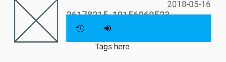
我想要一排 IconButton,彼此相邻,但实际图标和 IconButton 限制之间似乎有相当大的填充。我已经将按钮上的内边距设置为 0。
这是我的组件,非常简单:
class ActionButtons extends StatelessWidget {
  @override
    Widget build(BuildContext context) {
      return Container(
        color: Colors.lightBlue,
        margin: const EdgeInsets.all(0.0),
        padding: const EdgeInsets.all(0.0),
        child: Row(
          mainAxisAlignment: MainAxisAlignment.start,
          children: <Widget>[
            IconButton(
              icon: new Icon(ScanrIcons.reg),
              alignment: Alignment.center,
              padding: new EdgeInsets.all(0.0),
              onPressed: () {},
            ),
            IconButton(
              icon: new Icon(Icons.volume_up),
              alignment: Alignment.center,
              padding: new EdgeInsets.all(0.0),
              onPressed: () {},
            )
          ],
        ),
      );
    }
}
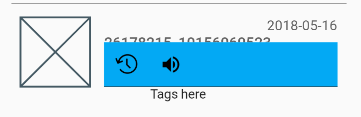
我想摆脱大部分浅蓝色空间,让我的图标在左侧较早开始,并且彼此更接近,但我找不到调整 IconButton 本身大小的方法。
我几乎确定这个空间是由按钮本身占据的,因为如果我将它们的对齐方式更改为
centerRightcenterLeft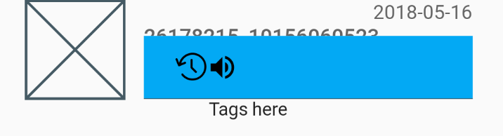
将实际图标变小也没有帮助,按钮仍然很大:
感谢您的帮助
11个回答
279
投票
投票
只需将空的
BoxConstraintsconstraintsIconButton(
padding: EdgeInsets.zero,
constraints: BoxConstraints(),
)
您必须传递空约束,因为默认情况下,IconButton 小部件假定最小尺寸为 48px。
95
投票
投票
解决此问题的两种方法。
仍然使用 IconButton
将 IconButton 包裹在具有宽度的容器内。
例如:
Container(
  padding: const EdgeInsets.all(0.0),
  width: 30.0, // you can adjust the width as you need
  child: IconButton(
  ),
),
使用 GestureDetector 代替 IconButton
您还可以使用 GestureDetector 代替 IconButton,这是 Shyju Madathil 推荐的。
GestureDetector( onTap: () {}, child: Icon(Icons.volume_up) )
27
投票
投票
并不是说那里有填充物。 IconButton 是一个 Material Design 小部件,它遵循可点击对象每边至少需要 48 像素的规范。 您可以从任何 IDE 单击进入 IconButton 实现。
您还可以半简单地获取 icon_button.dart 源代码并制作自己的 IconButton,它不遵循 Material Design 规范,因为整个文件只是组成其他小部件,并且只有 200 行,其中大部分是注释。
15
投票
投票
将
IconButton
包裹在容器中根本行不通,而是使用ClipRRect 并使用 Inkwell 添加材质小部件,只需确保为
ClipRRect小部件提供足够的边框半径😉。
ClipRRect(
    borderRadius: BorderRadius.circular(50),
    child : Material(
        child : InkWell(
            child : Padding(
                padding : const EdgeInsets.all(5),
                child : Icon(
                    Icons.favorite_border,
                    ),
                ),
            onTap : () {},
            ),
        ),
    )
5
投票
投票
您可以简单地使用 Icon 并用 GestureDetector 或 InkWell 包裹它,而不是删除 IconButton 周围的填充,如下所示
GestureDetector(
   ontap:(){}
   child:Icon(...)
);
如果您想要 IconButton 在单击时提供的波纹/墨水飞溅效果,请用 InkWell 包裹它
InkWell(
   splashColor: Colors.red,
   child:Icon(...)
   ontap:(){}
)
虽然第二种方法中在图标上抛出的 Ink 不会像 IconButton 那样准确,但您可能需要为此执行一些自定义实现。
3
投票
投票
这里有一个消除任何额外填充的解决方案,使用
InkWell
代替
IconButton:
Widget backButtonContainer = InkWell(
    child: Container(
      child: const Icon(
        Icons.arrow_upward,
        color: Colors.white,
        size: 35.0,
      ),
    ),
    onTap: () {
      Navigator.of(_context).pop();
    });
1
投票
投票
我在尝试在用户触摸屏幕的位置渲染图标时遇到了类似的问题。不幸的是,
Icon
类将您选择的图标包装在
SizedBox中。阅读一些 Icon 类源代码,发现每个 Icon 都可以被视为文本:
Widget iconWidget = RichText(
      overflow: TextOverflow.visible,
      textDirection: textDirection,
      text: TextSpan(
        text: String.fromCharCode(icon.codePoint),
        style: TextStyle(
          inherit: false,
          color: iconColor,
          fontSize: iconSize,
          fontFamily: icon.fontFamily,
          package: icon.fontPackage,
        ),
      ),
    );
因此,例如,如果我想渲染
Icons.details
来指示我的用户刚刚指向的位置,没有任何边距,我可以这样做:
Widget _pointer = Text(
      String.fromCharCode(Icons.details.codePoint),
      style: TextStyle(
        fontFamily: Icons.details.fontFamily,
        package: Icons.details.fontPackage,
        fontSize: 24.0,
        color: Colors.black
      ),
    );
Dart/Flutter 源代码非常平易近人,我强烈建议深入研究一下!
0
投票
投票
更好的解决方案是像这样使用
Transform.scale
:
 Transform.scale(
   scale: 0.5, // set your value here
   child: IconButton(icon: Icon(Icons.smartphone), onPressed: () {}),
 )
0
投票
投票
您可以使用ListTile,它为您提供了适合您需求的文本和图标之间的默认空间
ListTile(
         leading: Icon(Icons.add), //Here Is The Icon You Want To Use
         title: Text('GFG title',textScaleFactor: 1.5,), //Here Is The Text Also
         trailing: Icon(Icons.done),
         ),
0
投票
投票
我喜欢以下方式:
InkWell(
  borderRadius: BorderRadius.circular(50),
  onTap: () {},
  child: Container(
    padding: const EdgeInsets.all(8),
    child: const Icon(Icons.favorite, color: Colors.red),
  ),
),

-9
投票
投票
要显示飞溅效果(波纹),请使用
InkResponse
:
InkResponse(
  Icon(Icons.volume_up),
  onTap: ...,
)
如果需要,更改图标大小或添加填充:
InkResponse(
  child: Padding(
    padding: ...,
    child: Icon(Icons.volume_up, size: ...),
  ),
  onTap: ...,
)
最新问题
- VS 代码调试控制台不显示日志的行号
- 无法使用 Terraform 创建 EKS 集群 [实例未能加入 Kubernetes 集群]
- 使用 RateLimiter 将 Laravel 中的速率限制为每天 x 次
- 使用索引匹配单个字段的 CSV 的正则表达式
- CSS - 文本装饰
- 我想创建一个发送邮件的帖子
- Docker compose 无法在 Proxmox 上的虚拟机上运行 [已关闭]
- 如何在 Windows 11 中禁用控制台窗口的最大化按钮、通过拖动调整大小和 X 按钮?
- 对齐一行有效果且是链接的图像
- HTTPS 连接需要 HTTPS 代理吗?我可以使用 HTTP 代理吗?
- Lighthouse 未写入任何文件
- 在 drupal 7 中设置 cron 作业
- AJAX 端点应如何发出信号表明服务请求已失败?
- 如何在 Pandoc markdown 中格式化伪书目段落(不是真正的 biblatex 引文)以用于 PDF 和 EPUB 输出?
- 页面间传递数据时如何保证持久化?
- Docker compose 无法在 Proxmox 上的虚拟机上工作
- 如何部署 Azure CI/CD 来部署具有 2 个 sqlproj 的解决方案
- Dijkstra 具有正权重和循环的有向图算法
- 如何控制echarts饼图所选数据距中心的距离
- 2022 年 5 月 30 日之后如何通过 Google 使用 MailKit?
© www.soinside.com 2019 - 2024. All rights reserved.