MAUI .NET 8 图像不再适合按钮
问题描述 投票:0回答:1
我正在为 Windows 和 Mac 平台创建一个多平台 MAUI 应用程序。我最近已将项目更新到 .NET 8,但现在按钮遇到了一些问题。按钮中没有用于控制图像大小的属性。在 .NET 7 中,我能够通过更改填充值来控制图像大小。但这不再起作用了。
更新前按钮看起来像这样;

更新到.NET 8后,所有带有图像的按钮现在看起来像这样;

这是我当前使用的
XAML<Button Text="User" ImageSource="dotnet_bot.png" Padding="0,15,83,5" HeightRequest="35" HorizontalOptions="Start" WidthRequest="225"/>
额外信息
我尝试创建自定义控件,但除了按钮控件之外,我们无法定义单击或按下事件。所以,这个解决方案也行不通。
我研究过其他解决方案,但它们都在.NET 8之前得到了解答。以下是我看过的一些问题; 这个、这个、这个、这个、这个和这个问题。
此外,
属性也没有帮助。它只是调整文本和图像之间的间距。ContentLayout较小的图像可能是一个解决方案,但更改此问题的所有资产并不是一个好方法。我们需要这些不同规模的资产。
这个问题有什么解决办法吗?任何想法表示赞赏,谢谢!
1个回答
0
投票
投票
您的评论表明您的自定义控件尝试的手势识别器存在一些问题。我想提供使用
TapGestureRecognizerClickedPressedImageLabel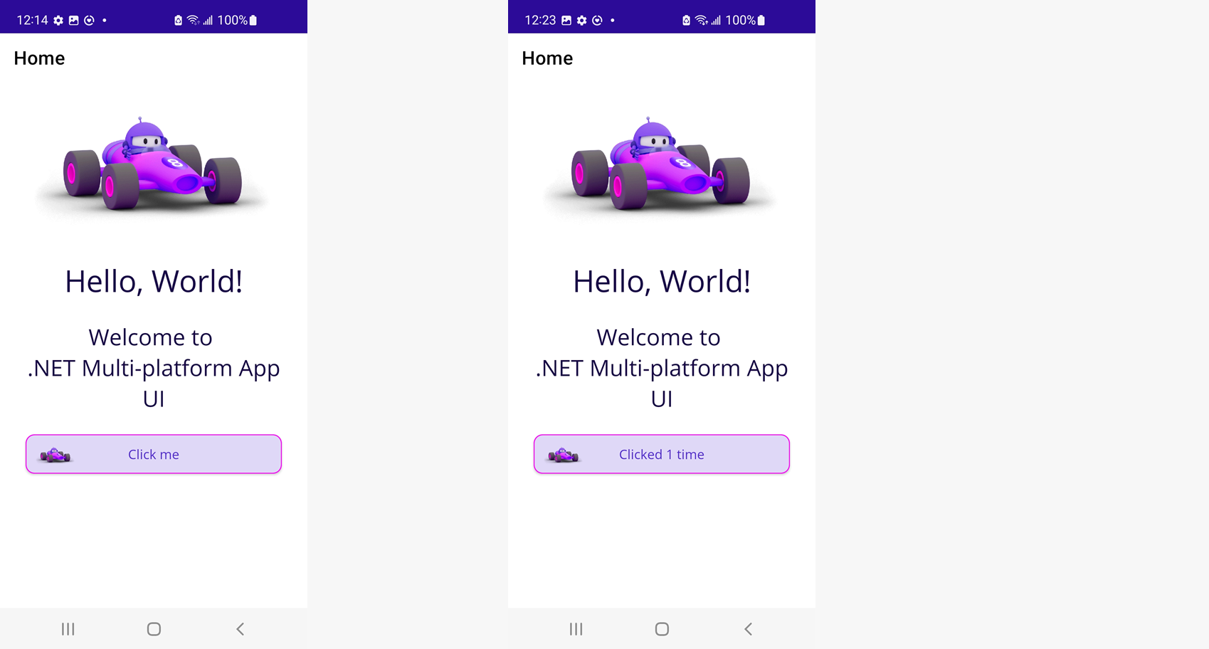
LabelImageInputTransparent="True"FrameFrame.CornerRadiusImageMarginImageSource<?xml version="1.0" encoding="utf-8" ?>
<Frame
xmlns="http://schemas.microsoft.com/dotnet/2021/maui"
xmlns:x="http://schemas.microsoft.com/winfx/2009/xaml"
xmlns:controls="clr-namespace:net_8_image_buttons.Controls"
x:Class="net_8_image_buttons.Controls.ButtonEx"
Padding="0"
CornerRadius="10">
<Grid
ColumnDefinitions="Auto,*">
<!--Pull properties down from the wrapper for individual controls-->
<Button
x:Name="GestureRecognizerEx"
Grid.ColumnSpan="2"
HorizontalOptions="Fill"
VerticalOptions="Fill"
BackgroundColor="Transparent"
CornerRadius="{Binding Path=CornerRadius, Source={RelativeSource AncestorType={x:Type controls:ButtonEx}}}"
BorderColor="{Binding Path=BorderColor, Source={RelativeSource AncestorType={x:Type controls:ButtonEx}}}"
BorderWidth="{Binding Path=BorderWidth, Source={RelativeSource AncestorType={x:Type controls:ButtonEx}}}"/>
<Image
WidthRequest="50"
Source="{Binding Path=ImageSource, Source={RelativeSource AncestorType={x:Type controls:ButtonEx}}}"
Margin="{Binding Path=ImageMargin, Source={RelativeSource AncestorType={x:Type controls:ButtonEx}}}"
InputTransparent="True"/>
<Label
Grid.Column="0"
Grid.ColumnSpan="2"
Text="{Binding Path=Text, Source={RelativeSource AncestorType={x:Type controls:ButtonEx}}}"
TextColor="{Binding Path=TextColor, Source={RelativeSource AncestorType={x:Type controls:ButtonEx}}}"
VerticalOptions="Center"
HorizontalOptions="Center"
InputTransparent="True"/>
</Grid>
</Frame>
自定义可绑定属性
您可以使
ButtonExButtonpublic partial class ButtonEx : Frame
{
public ButtonEx()
{
InitializeComponent();
GestureRecognizerEx.Clicked += (sender, e) => Clicked?.Invoke(this, e);
GestureRecognizerEx.Pressed += (sender, e) => Pressed?.Invoke(this, e);
}
public static readonly BindableProperty TextProperty =
BindableProperty.Create(nameof(Text), typeof(string), typeof(ButtonEx), default(string));
public string Text
{
get => (string)GetValue(TextProperty);
set => SetValue(TextProperty, value);
}
public static readonly BindableProperty ImageSourceProperty =
BindableProperty.Create(nameof(ImageSource), typeof(ImageSource), typeof(ButtonEx), default(ImageSource));
public static readonly BindableProperty TextColorProperty =
BindableProperty.Create(nameof(TextColor), typeof(Color), typeof(ButtonEx), default(Color));
public Color TextColor
{
get => (Color)GetValue(TextColorProperty);
set => SetValue(TextColorProperty, value);
}
public static readonly BindableProperty BorderWidthProperty =
BindableProperty.Create(nameof(BorderWidth), typeof(double), typeof(ButtonEx), default(double));
public double BorderWidth
{
get => (double)GetValue(BorderWidthProperty);
set => SetValue(BorderWidthProperty, value);
}
public ImageSource ImageSource
{
get => (ImageSource)GetValue(ImageSourceProperty);
set => SetValue(ImageSourceProperty, value);
}
public static readonly BindableProperty ImageMarginProperty =
BindableProperty.Create(nameof(ImageMargin), typeof(Thickness), typeof(ButtonEx), default(Thickness));
public Thickness ImageMargin
{
get => (Thickness)GetValue(ImageMarginProperty);
set => SetValue(ImageMarginProperty, value);
}
public event EventHandler? Clicked;
public event EventHandler? Pressed;
}
最新问题
- Copilot Studio Azure 开放 AI 奖状
- 在 Chrome 扩展中拦截 XMLHttpRequest 的问题
- docker 中找不到文件
- 如何在 Windows 10 中自定义游戏手柄控制器操纵杆输出灵敏度
- NSTableView 选择时更改单元格颜色
- 'main' 已在 xxx.obj 中定义
- Etsy - 获取销售额
- 在打字稿中用 import 替换 require
- 如何检查不同的属性
- monorepo (lerna) 包内的 React 应用程序导致“react”包发生冲突
- 提供接口的方法而不是在java中实现接口
- 我做了问题用餐时间需要做的事情,但我不知道如何改进这段代码来解决这个问题
- 在 Jitpack 中构建 Android 库:错误:未找到构建工件
- 如何计算从一行列到下一行不同列的 DateDiff
- 测试变量是否为只读
- Tensorflow 无法识别 CUDA 11.8,但 Pytorch 可以识别
- CSS 将 4 个分区放在页面底部
- 如何使用 telethon 会话文件通过 Pyrogram 登录
- git push --镜像失败
- 在库比蒂诺选项卡栏视图内外导航
© www.soinside.com 2019 - 2024. All rights reserved.