无法更改TextField边框颜色
问题描述 投票:18回答:5
我试图使用TextField改变我的BorderSide边框的颜色,但它不起作用。
这是我的代码。
new TextField(
decoration: new InputDecoration(
border: new OutlineInputBorder(
borderSide: new BorderSide(color: Colors.teal)
),
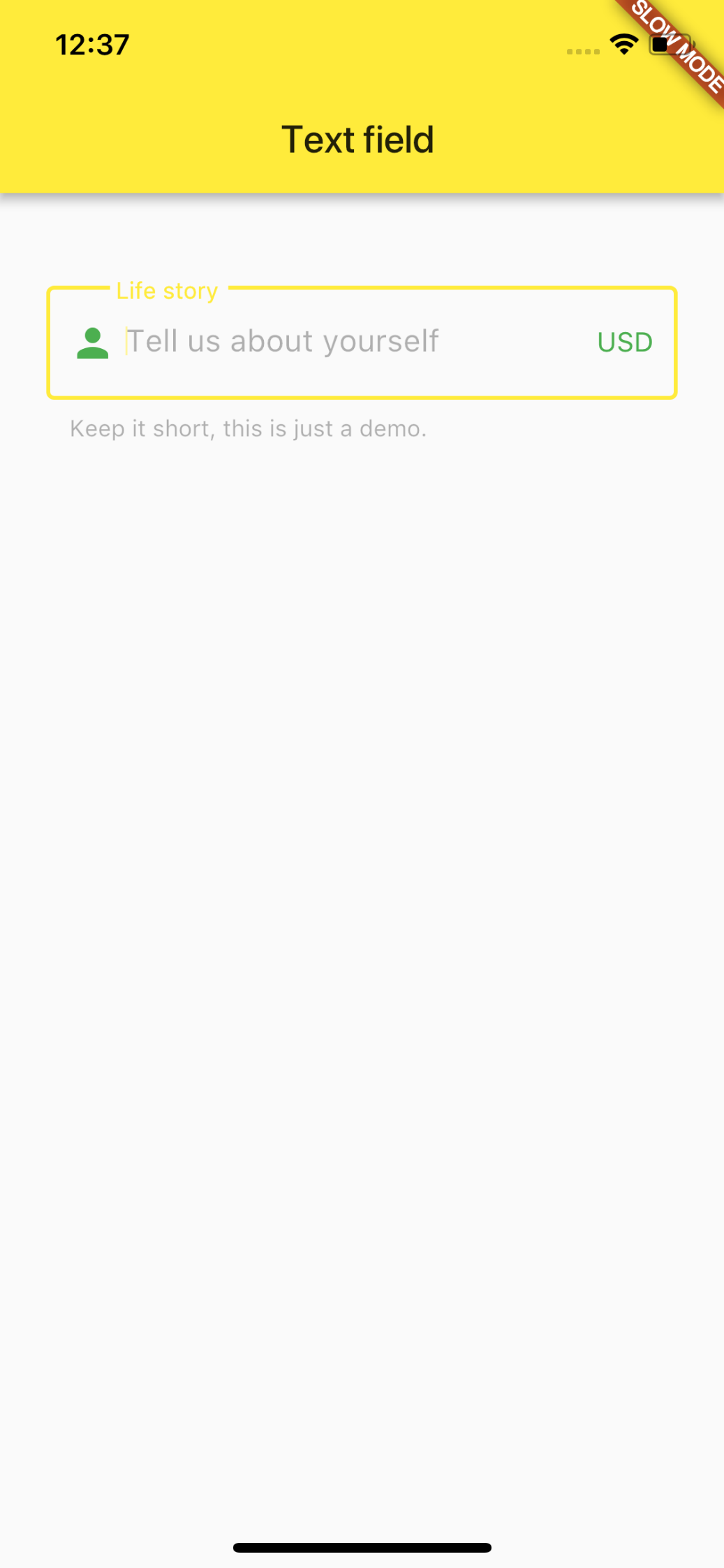
hintText: 'Tell us about yourself',
helperText: 'Keep it short, this is just a demo.',
labelText: 'Life story',
prefixIcon: const Icon(Icons.person, color: Colors.green,),
prefixText: ' ',
suffixText: 'USD',
suffixStyle: const TextStyle(color: Colors.green)),
)
)
结果截图如下所示。
5个回答
24
投票
投票
新的方法是使用这样的enabledBorder:
new TextField(
  decoration: new InputDecoration(
    enabledBorder: const OutlineInputBorder(
      borderSide: const BorderSide(color: Colors.grey, width: 0.0),
    ),
    focusedBorder: ...
    border: ...
  ),
)
23
投票
投票
由于默认主题设置为屏幕,因此不会更改。
因此,只需通过使用新的ThemeData()包装TextField来更改您正在绘制的小部件
child: new Theme(
          data: new ThemeData(
            primaryColor: Colors.redAccent,
            primaryColorDark: Colors.red,
          ),
          child: new TextField(
            decoration: new InputDecoration(
                border: new OutlineInputBorder(
                    borderSide: new BorderSide(color: Colors.teal)),
                hintText: 'Tell us about yourself',
                helperText: 'Keep it short, this is just a demo.',
                labelText: 'Life story',
                prefixIcon: const Icon(
                  Icons.person,
                  color: Colors.green,
                ),
                prefixText: ' ',
                suffixText: 'USD',
                suffixStyle: const TextStyle(color: Colors.green)),
          ),
        ));
10
投票
投票
更改primaryColor和primaryColorDark颜色的代码不会改变边框的颜色,只有点击颜色保持黑色
必须更改的属性是hintColor
BorderSide不应该用于此,你需要改变主题。
要使红色默认将主题放在MaterialApp(theme: ...)中并更改特定小部件的主题,例如将默认红色更改为小部件的黄色,请使用以下内容围绕小部件:
new Theme(
  data: new ThemeData(
    hintColor: Colors.yellow
  ),
  child: ...
)
下面是代码和gif:
请注意,如果我们将primaryColor颜色定义为黑色,则通过点击小部件将其选择为黑色
但是要更改窗口小部件中的标签和文本,我们需要将主题设置为InputDecorationTheme
以黄色开头的小部件有自己的主题,以红色开头的小部件具有使用函数buildTheme()定义的默认主题
import 'package:flutter/material.dart';
void main() => runApp(new MyApp());
ThemeData buildTheme() {
final ThemeData base = ThemeData();
return base.copyWith(
hintColor: Colors.red,
primaryColor: Colors.black,
inputDecorationTheme: InputDecorationTheme(
hintStyle: TextStyle(
color: Colors.blue,
),
labelStyle: TextStyle(
color: Colors.green,
),
),
);
}
class MyApp extends StatelessWidget {
@override
Widget build(BuildContext context) {
return new MaterialApp(
theme: buildTheme(),
home: new HomePage(),
);
}
}
class HomePage extends StatefulWidget {
@override
_HomePageState createState() => new _HomePageState();
}
class _HomePageState extends State<HomePage> {
String xp = '0';
@override
Widget build(BuildContext context) {
return new Scaffold(
appBar: new AppBar(),
body: new Container(
padding: new EdgeInsets.only(top: 16.0),
child: new ListView(
children: <Widget>[
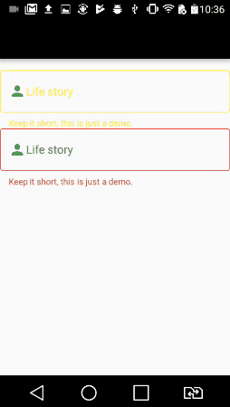
new InkWell(
onTap: () {},
child: new Theme(
data: new ThemeData(
hintColor: Colors.yellow
),
child: new TextField(
decoration: new InputDecoration(
border: new OutlineInputBorder(),
hintText: 'Tell us about yourself',
helperText: 'Keep it short, this is just a demo.',
labelText: 'Life story',
prefixIcon: const Icon(Icons.person, color: Colors.green,),
prefixText: ' ',
suffixText: 'USD',
suffixStyle: const TextStyle(color: Colors.green)),
)
)
),
new InkWell(
onTap: () {},
child: new TextField(
decoration: new InputDecoration(
border: new OutlineInputBorder(
borderSide: new BorderSide(color: Colors.teal)
),
hintText: 'Tell us about yourself',
helperText: 'Keep it short, this is just a demo.',
labelText: 'Life story',
prefixIcon: const Icon(Icons.person, color: Colors.green,),
prefixText: ' ',
suffixText: 'USD',
suffixStyle: const TextStyle(color: Colors.green)),
)
)
],
),
)
);
}
}
1
投票
投票
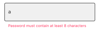
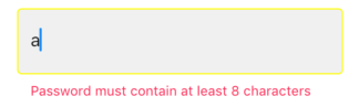
好吧,我真的不知道为什么分配给边框的颜色不起作用。但您可以使用文本字段的其他边框属性控制边框颜色。他们是:
- disabledBorder:启用时激活设置为false
- enabledBorder:启用时激活设置为true(默认情况下,TextField的enabled属性为true)
- errorBorder:在出现错误时激活(即验证失败)
- focusedBorder:当我们单击/聚焦TextField时激活。
- focusedErrorBorder:当出现错误时激活,我们当前关注的是TextField。
代码段如下:
TextField(
enabled: false, // to trigger disabledBorder
decoration: InputDecoration(
filled: true,
fillColor: Color(0xFFF2F2F2),
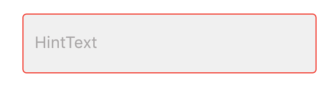
focusedBorder: OutlineInputBorder(
borderRadius: BorderRadius.all(Radius.circular(4)),
borderSide: BorderSide(width: 1,color: Colors.red),
),
disabledBorder: OutlineInputBorder(
borderRadius: BorderRadius.all(Radius.circular(4)),
borderSide: BorderSide(width: 1,color: Colors.orange),
),
enabledBorder: OutlineInputBorder(
borderRadius: BorderRadius.all(Radius.circular(4)),
borderSide: BorderSide(width: 1,color: Colors.green),
),
border: OutlineInputBorder(
borderRadius: BorderRadius.all(Radius.circular(4)),
borderSide: BorderSide(width: 1,)
),
errorBorder: OutlineInputBorder(
borderRadius: BorderRadius.all(Radius.circular(4)),
borderSide: BorderSide(width: 1,color: Colors.black)
),
focusedErrorBorder: OutlineInputBorder(
borderRadius: BorderRadius.all(Radius.circular(4)),
borderSide: BorderSide(width: 1,color: Colors.yellowAccent)
),
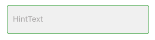
hintText: "HintText",
hintStyle: TextStyle(fontSize: 16,color: Color(0xFFB3B1B1)),
errorText: snapshot.error,
),
controller: _passwordController,
onChanged: _authenticationFormBloc.onPasswordChanged,
obscureText: false,
),
disabledBorder:
enabledBorder:
focusedBorder:
errorBorder:
errorFocusedBorder:
希望它能帮到你。
-1
投票
投票
enabledBorder: OutlineInputBorder(
  borderRadius: BorderRadius.circular(10.0),
  borderSide: BorderSide(color: Colors.red)
),
最新问题
- 如何从有效控件中禁用 Bootstrap 4 验证样式
- 是否可以在没有窗口或其他 UIElement 的情况下显示 WinUi3 MenuFlyout?
- 在 Azure AD B2C 中,是否可以在 Azure 门户上编辑用户的(自定义)属性?
- 如何递归检查嵌套对象中是否存在值
- git rebase 会更新所有提交 ID 吗?
- 如何正确执行异步Windows服务ExecuteAsync?
- 实现 scipy Butterworth 过滤器来对 numpy 数组序列中包含的数据进行操作
- C 仅当返回 false 时才在循环中调用函数
- Python 3:将向量乘以矩阵,无需 NumPy
- 如何向 ExtJS 组合框添加空项目?
- median() 尝试将列更改为数字
- 通过 Zod 转换输入时键入错误
- Github Actions:仅保留每个分支上最新版本的工件
- Go 1.18 中如何访问泛型结构中的共享字段?我收到错误“type t has no field or method DATE_START”[重复]
- 为什么android要在linux内核中引入binder?
- 如何在R中读取.db文件的内容?
- 只能在 WSL2 中以 root 身份运行 docker
- 不使用 aspnet_compiler.exe 的 -u 选项时的副作用
- 64位delphi应用程序中的{$SetPEFlags IMAGE_FILE_LARGE_ADDRESS_AWARE}
- 在 C# Windows 窗体中,如果我不想修改设计器中的代码,我应该如何取消订阅后面代码中的事件?
© www.soinside.com 2019 - 2024. All rights reserved.